We all have to accept the fact that society is changing, and that we have to change too if we want to stay on top of any situation. Nowadays each one of us has a cellphone and many own a smartphone.
Because of the rush that we live in, we always have to be up to date with latest news and to be able to search, browse, compare and analyze websites right on the spot. But what do you do when a site fails to load on a mobile device, or has a very unfriendly look because of the desktop version unable to fit on a mobile screen. Well, i know for sure that lots of you will simply exit that website and search for an alternative mobile friendly solution.
It’s strange to see that companies fail to adapt to society and have their websites optimized for a better experience of the users. As facts, in 2013 the number of mobile devices connected to the internet exceeded the ones of the classic computers, and also, at any instance 30 percent of all internet traffic is generated from a smartphone or a tablet, and this numbers are only going to grow in 2014.
It’s easy to see the pros and cons of a mobile browsing experience and mostly the cons relate to the websites that don’t give useful information in the best way so that it can be received well. A bad mobile experience can even lead to damaging a company’s brand, not mentioning all the loses in the e-commerce branch that can survey for a retailer.
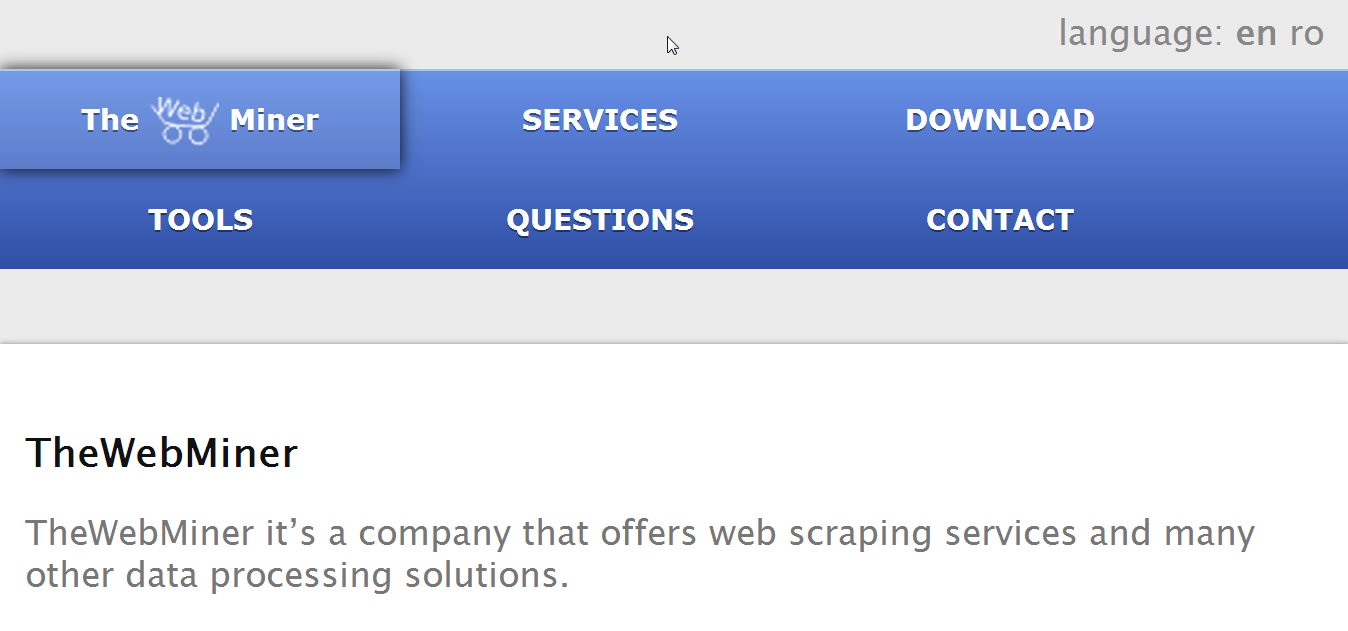
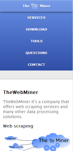
Starting a month ago TheWebMiner has implemented a mobile aware of the site for a better experience of the visitors and hopefully of the future partners. We hope that you will enjoy reading the latest posts of our blog on the go and that it will be much easier for you to find web scraping information for your company!
How website look on tablet
How website look on smartphone

